Several compounding problems, numerous open issues
Sentry Dashboards hadn't been meaningfully updated since 2021. The gap had become impossible to ignore.
Only 12k users actively viewing dashboards vs 1M+ for Issues. Week-4 retention at 21.5% — one of the lowest rates in the product.
Dated interaction patterns, broken flows, and glitchy experiences that had never been addressed due to competing priorities.
Only 4 templates and 12 pre-built widgets — far behind competitors with extensive template catalogues.
Favouriting, sharing, edit access — features users expected as standard — had simply never been built.
"Is there a way to star or save dashboards? Browsing through them each time is a pretty big hassle — the sorting options don't really work for that. I always have to use the search function."
— GitHub issue, Sentry open-source repo
The only designer on a product area being rebuilt from scratch
Lead and sole designer across the entire dashboard surface — owning strategy, exploration, and execution while securing multi-quarter leadership buy-in for the long-term investment.
End-to-end design across all dashboard surfaces — widgets, sharing, favouriting, the custom widget builder, and the design library
Backlog prioritisation, release planning, and product strategy — defining what got built in what order and why
Design principles, documentation, and the strategic framing that secured senior leadership buy-in for the long-term investment
Engineering constraints on a legacy codebase, competing priorities, and the tension between quick wins and long-term vision
Two tracks, not one — ship fast while designing deep
Rather than waiting for the full vision, I proposed a dual-track approach — shipping quick wins to restore trust while designing the bigger picture properly.
Rapid mid-fi solutions shipped close to engineering. High-value, lower-complexity fixes that users had been asking for.
Strategic explorations, user testing, and stakeholder alignment on the bigger flows — designed and tested properly.
I also defined four design principles for all dashboard widgets — Uniformity, Customisable, Informative, and Ubiquitous — giving engineering and design a shared north star for every decision.
Rebuilding the Custom Widget flow — the hardest part of dashboards
High widget-level customisation is a key differentiator for Sentry's Business tier. A broken builder directly impacts retention and upgrade conversion.
Accessibility issues, sticky widget overlaps, poor use of screen space, and a non-sequential flow depicted as if it were linear.
💬 A walkthrough video of the current experience is available on request.
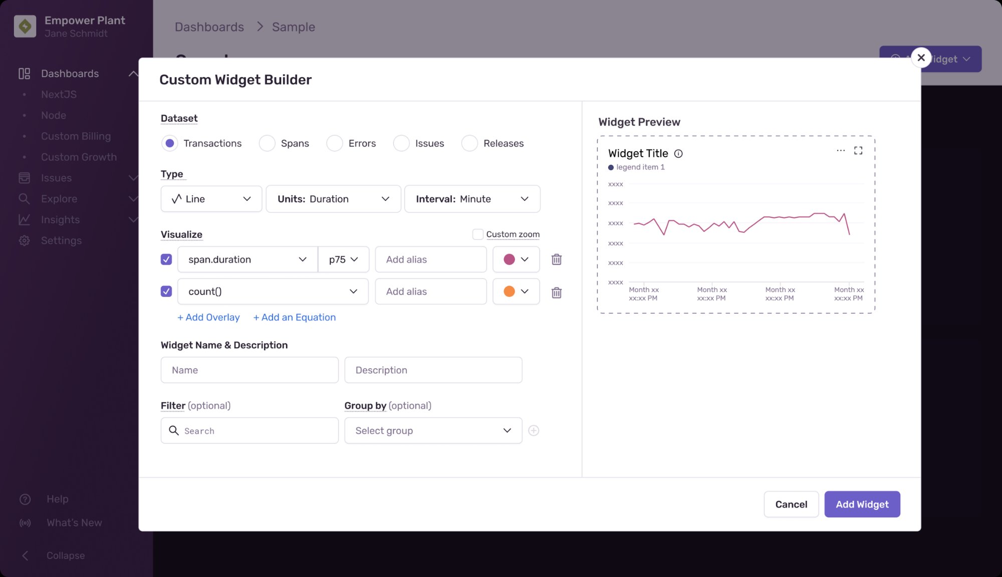
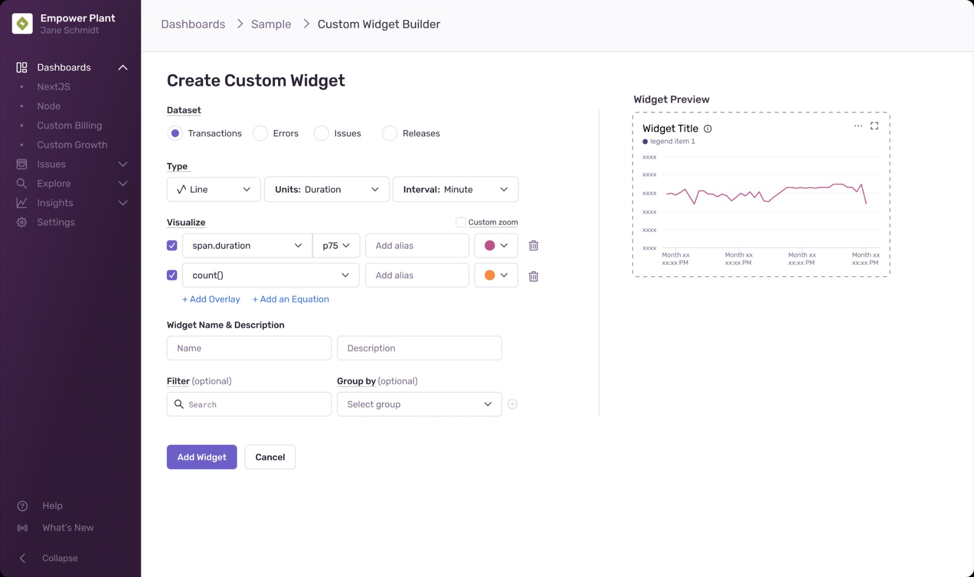
Exploring the right pattern
Before jumping to solutions, I explored three fundamentally different interaction models — each with real trade-offs.
Great use of space, cleaner UI, continued flow. Validated through user testing.
Uses existing patterns, perception of continued flow — but high probability of scrolling.
Improved flow and space — but navigating to a new page broke the sense of continuity.
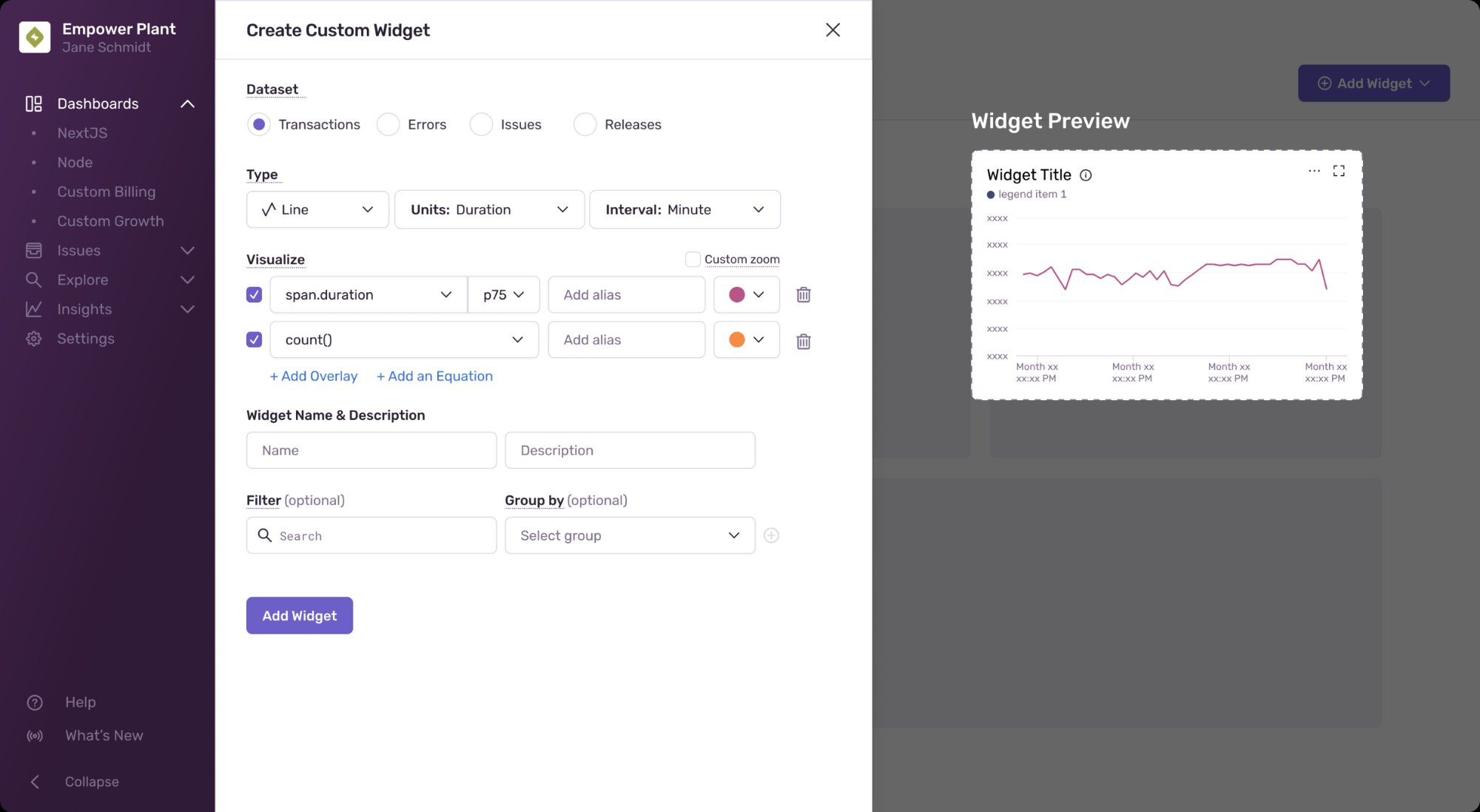
Improved form-filling, upfront widget preview while making changes, high level of customisation, less overwhelming on screen
Field ordering, unclear widget description placement, overlay vs panel due to scrolling probability
Four things shipped in a single quarter that immediately moved the needle
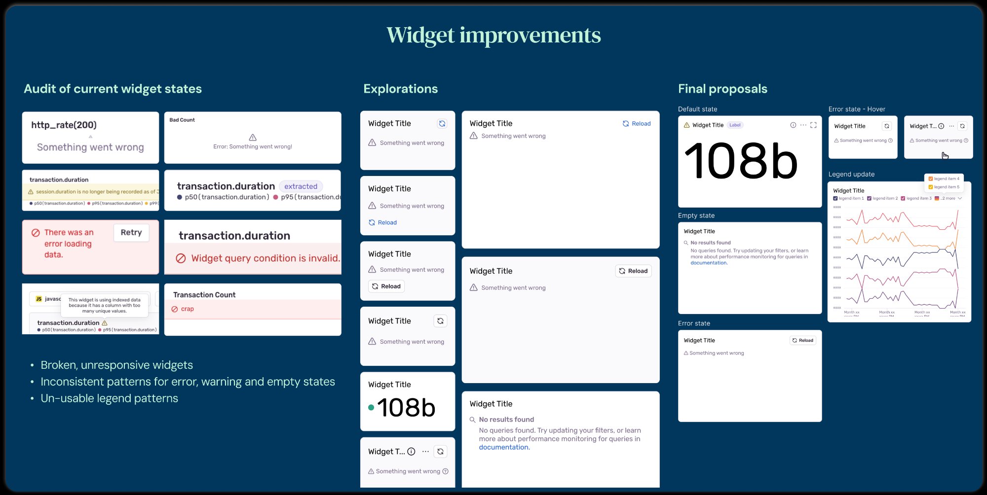
Audited all existing widget states and designed a unified system. Addressed broken error states, inconsistent empty states, and unusable legend patterns across every widget size.
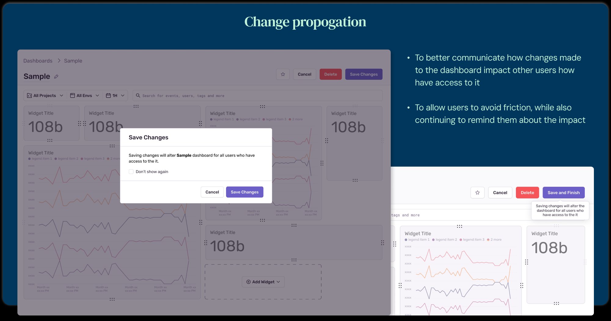
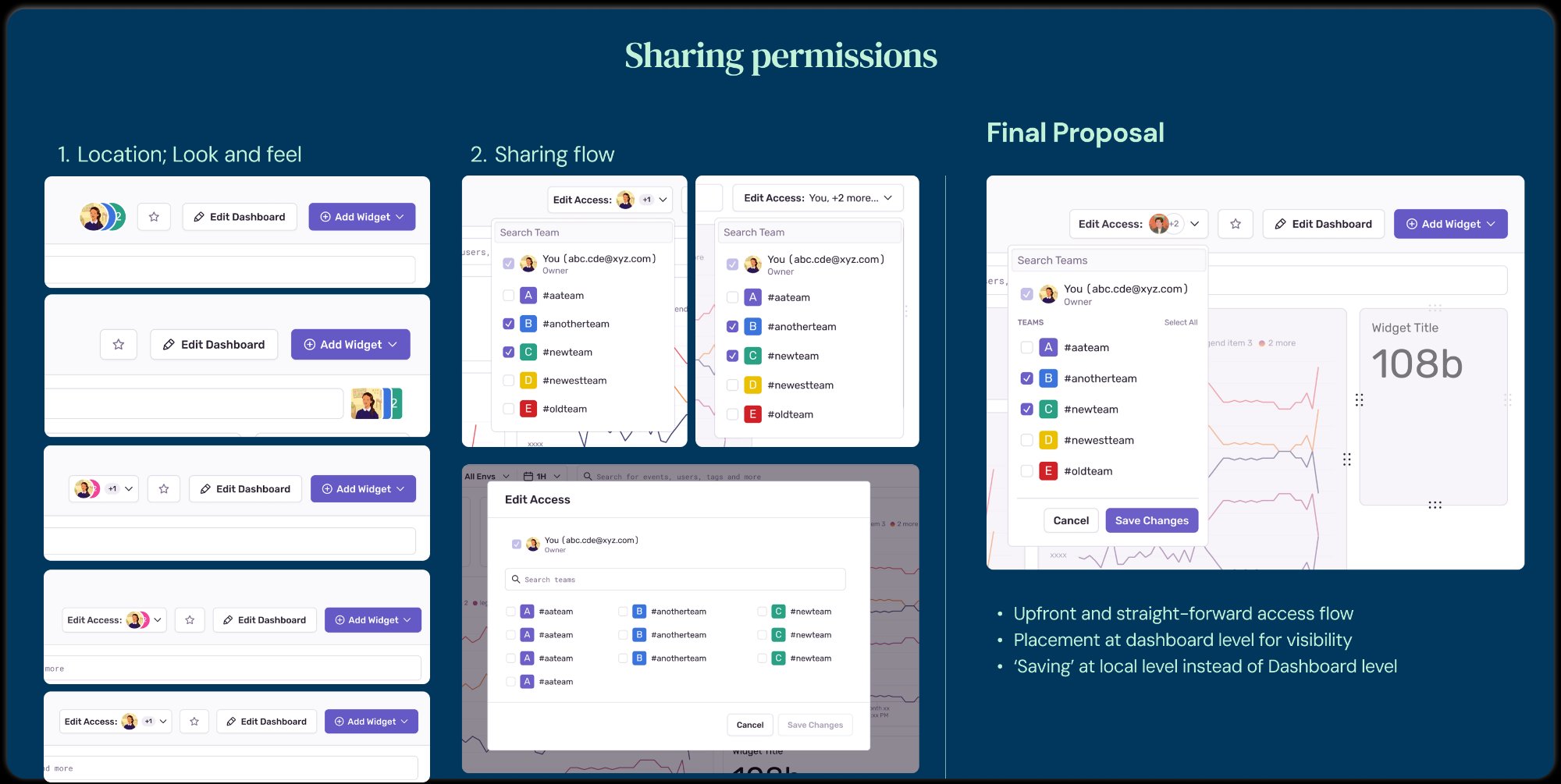
Built an upfront, straight-forward access flow at dashboard level. Moved saving to local level so edits don't accidentally overwrite the experience for all collaborators.
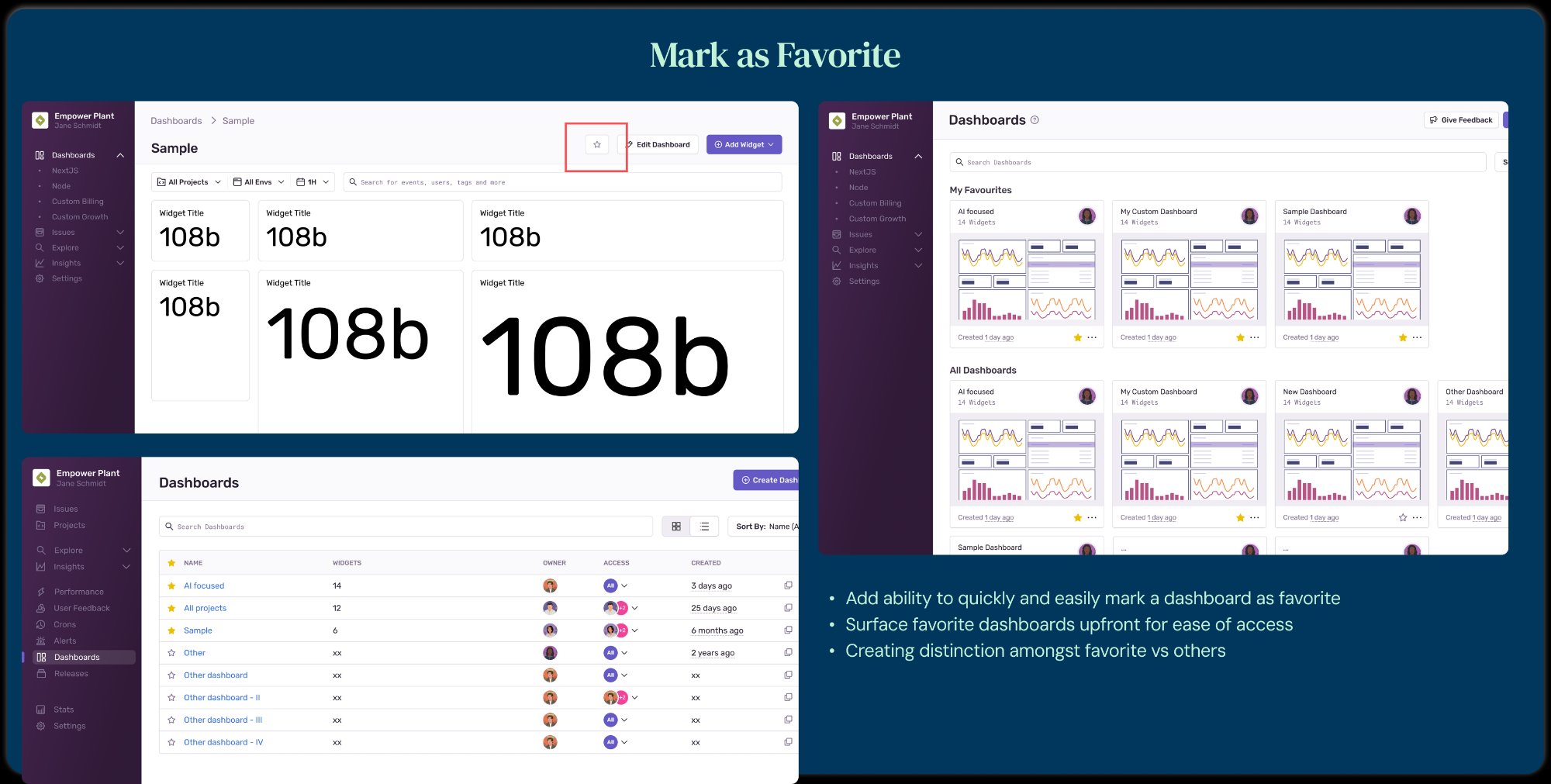
64% of Business tier orgs adopted this on day one — a feature users had been publicly requesting for years. Star a dashboard, surface it upfront, done.
Designed clear communication for how edits affect other users with access. Reduced accidental overwrites and eliminated a major source of team confusion.